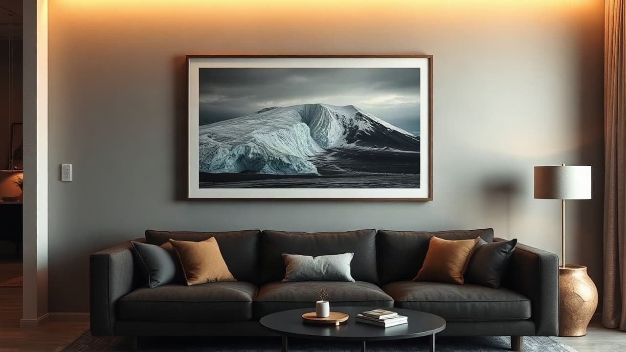
How to Choose the Right Iceland Print for Your Home
F
Fotografi3. september 2026Size, paper, subject, room — a practical guide to finding the Iceland print that will look perfect in your space.
Bringing Iceland home is more than just picking a beautiful photograph. The right print becomes part of your space—it sets a mood, anchors a room, and reminds you of the feeling you had standing in front of that glacier or black sand beach. Choosing well means thinking about how the image lives with your other belongings, not just how striking it looks on a screen.
Match the Image Mood to Your Room's Energy
Before you fall in love with a specific photograph, think about what emotional tone your room needs. Iceland's landscape offers wildly different moods, and the right match will feel intentional rather than random.
- Serene and calming: Soft-focus misty mornings, still fjord reflections, or pale Icelandic light work beautifully in bedrooms and meditation spaces. These prints create breathing room—literally.
- Bold and energetic: Dramatic waterfalls, volcanic landscapes, and high-contrast black lava fields demand attention. These belong in living rooms, offices, or entryways where you want visual impact.
- Moody and introspective: Storm clouds, dark mountains, and twilight hour shots suit creative spaces and studies. They encourage focus without feeling cold.
- Warm and intimate: Golden hour light on Icelandic moss, sunset reflections, and close-up detail shots work in dining rooms and gathering spaces—they invite people in.
Our curated collection at Fotografi spans all these moods. Because we've been selecting prints since 2007, we understand that the best images aren't always the most obvious ones. Sometimes the quiet corner of a landscape tells a truer story than the postcard-perfect vista.
Consider Your Wall Space: Size, Orientation, and Placement
A stunning print on the wrong wall is like a perfect song in the wrong room—it just doesn't land. Before you decide, measure and really look at your space.
- Above a sofa: Go larger than you think. A 50×70 cm or even 70×100 cm print creates a focal point without overwhelming. Landscape orientation (wider than tall) typically works best here.
- Gallery walls: Mix portrait and landscape orientations. A 30×40 cm print paired with a 40×30 cm creates rhythm. This is where Fotografi's range of Icelandic scenes shines—you can tell a visual story across multiple images.
- Narrow hallways or corridors: Portrait orientation (taller than wide) works better. A 30×40 cm or 40×60 cm keeps the space feeling open rather than cluttered.
- Shelving or mantels: Smaller prints (20×30 cm or 30×40 cm) feel more intentional than oversized. They share the space rather than dominate it.
- Tight corners or alcoves: Don't assume small spaces need small prints. Sometimes a bold 50×70 cm in a corner creates depth and draws the eye in.
A useful rule: if you can comfortably extend your arm and touch the print without leaning, the size is probably right. When you visit Fotografi on Skólavörðustígur, you can hold different sizes and see how they feel in your hands—that instinct matters more than any formula.
Matte Finish: Why It Changes Everything
This is where print quality becomes personal. A matte finish isn't just a aesthetic choice—it's about how the photograph lives in your home over time.
Matte finishes: Absorb light and reduce glare, so the image sits quietly on your wall. They feel more like fine art and less like a commercial poster. Matte also hides fingerprints and dust better, and the ink feels more integrated into the paper itself. In rooms with natural light, matte prints age beautifully—they don't get washed out or develop hot spots.
For Icelandic landscapes, matte finishes respect the subtle tones that make these images work: the grey-blue of a glacier, the complex greys of basalt, the soft luminescence of an Arctic sky. A glossy finish can oversaturate these delicate palettes.
We print on museum-quality paper at Fotografi because we ship these images directly from Iceland—they carry real provenance. A matte finish on archival paper means your print won't yellow or fade the way cheaper prints do. This matters if you're bringing home something that actually meant something to you.
Landscape vs. Portrait: What the Orientation Says
Orientation isn't arbitrary. It shapes how your eye moves through the image and how the print relates to your room's architecture.
- Landscape (horizontal): Natural for horizons, waterfalls that spread across a valley, or wide-angle glacier views. Landscape orientation feels expansive and restful. It works with the horizontal lines most rooms already have.
- Portrait (vertical): Draws the eye upward. Dramatic for tall waterfalls, cliff faces, or mountains that command the sky. Portrait orientation works in rooms with high ceilings or where you want to emphasize vertical lines.
The right orientation also depends on what you're framing. A fjord that stretches across a peninsula demands landscape. A towering waterfall needs portrait. At Fotografi, we've selected and printed these images in the orientation that serves them best—but we also understand that your wall might need something different. That conversation is worth having when you're choosing.
The
Fleiri greinar
The Story Behind the Cameras on Our Walls
Over 300 vintage film cameras hang on the walls of our Reykjavík shop. Here's how they got there — and what they mean to us.
5 Iceland Landscapes You Need on Your Wall
From the aurora over Kirkjufell to the black sands of Reynisfjara — the Iceland prints our customers keep coming back for.